iCHEF
Iterate on the ordering website to enhance the customer experience
Duration
2022/5 - Present (Ongoing iteration)
Team
Product Manager *1
Product Designer *3
Engineers (Front-end, Back-end, iOS) *3
My Role
Product designer, responsible for: survey, interface design, stakeholders review.
Project Background
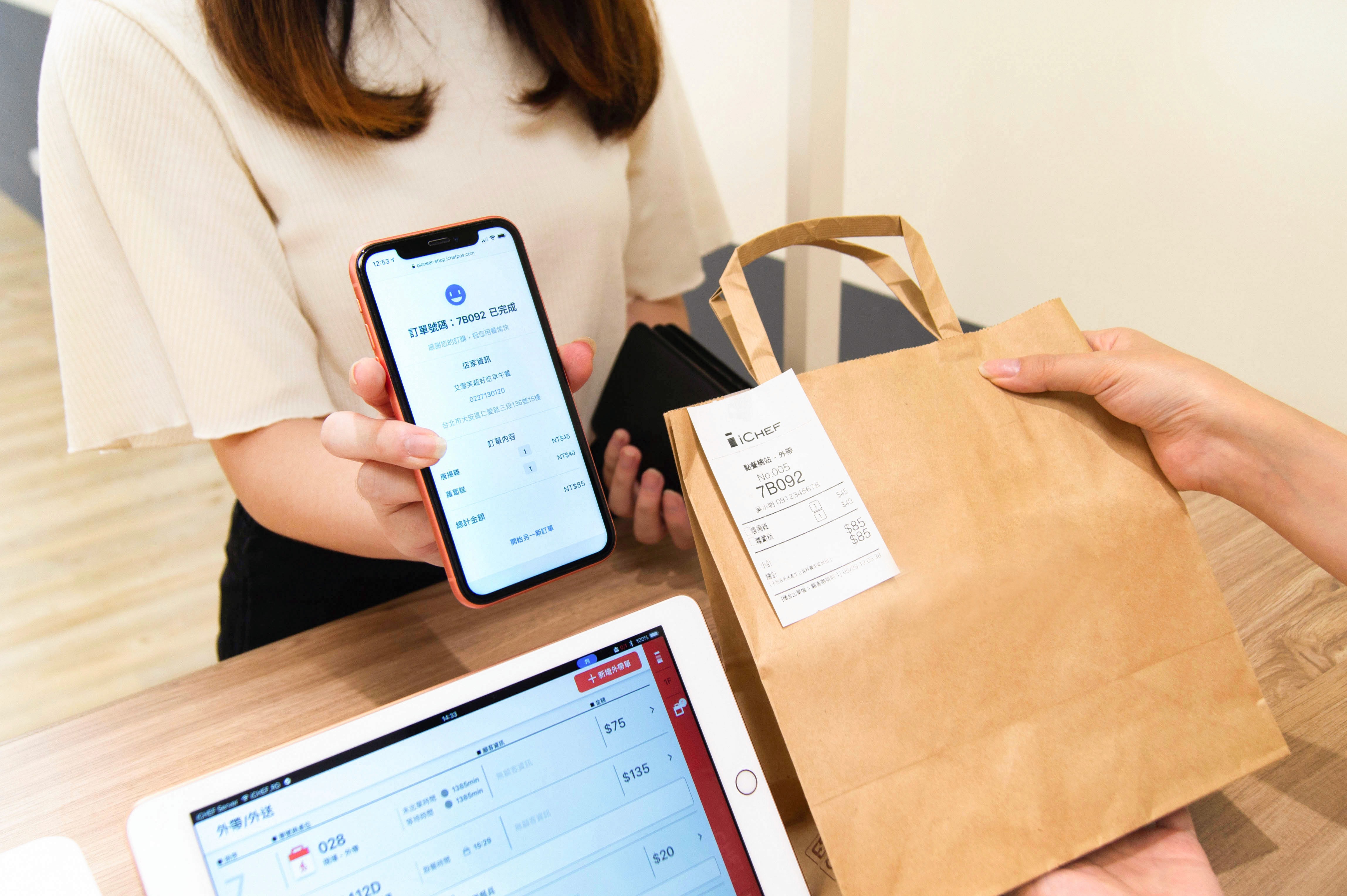
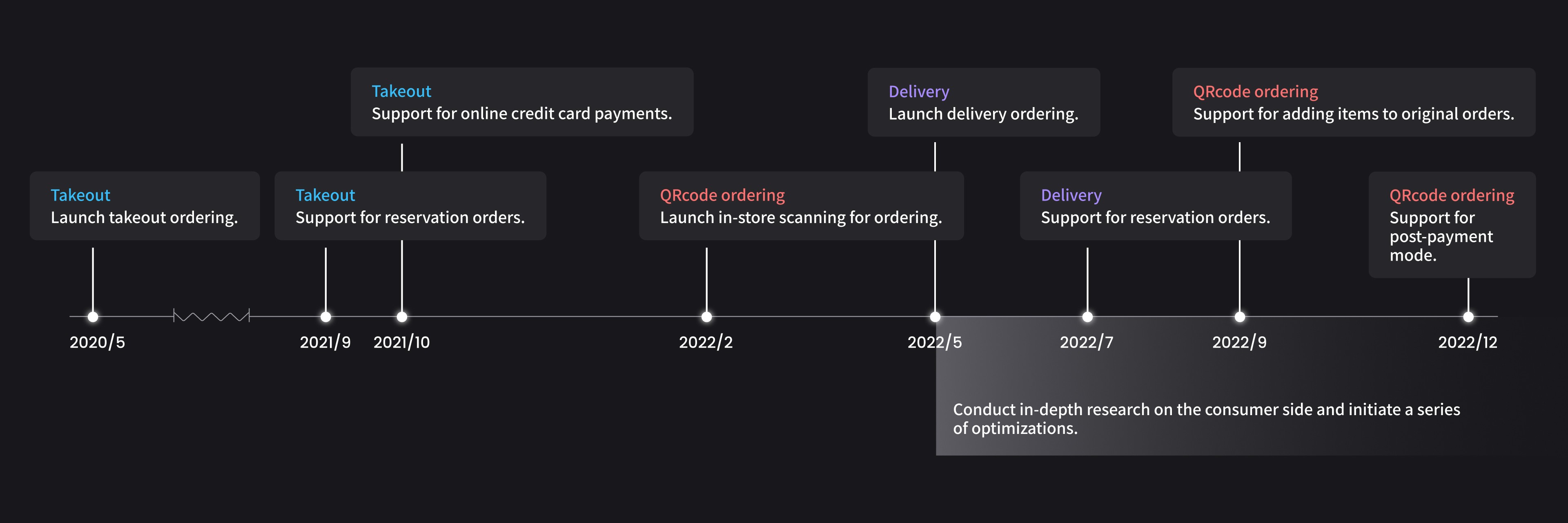
iCHEF is a Point-of-Sale software company that launched its "online ordering" service in May 2020 during the pandemic. This service allows merchants to maintain a continued and stable source of income through their own online ordering websites, even under strict conditions that prohibit in-person dining.
Two years after the launch, approximately 14.3% of iCHEF's total stores remain active online ordering stores (with at least one order per month).
After the foundational functions of the online ordering (takeout, delivery, QRcode ordering) were gradually completed, we conducted a comprehensive consumer experience study in May 2022 in order to provide businesses with a more intuitive and seamless integration of online and offline experiences.
We initiated a series of iteration projects, hoping to assist merchants in better serving consumers and to increase the adoption rate of online ordering.
Business Goal
Promoting the growth of online ordering revenue
We hope to enhance the consumer experience to increase the online ordering amount (GMV) , with the main product indicators being the number of active stores and credit card revenue, as the latter will provide us with higher profit margins. The growth data in May 2023 compared to May 2022 is as follows:
In addition to the consumer experience, there is also a product team responsible for meeting the needs of the merchant side. Furthermore, due to the labor shortage in the restaurant industry, the proportion of merchants adopting QRcode ordering is increasing, successfully boosting iCHEF's revenue.
Percentage growth of active stores
+
%
Takeout and delivery
+
%
QRcode ordering
Credit card revenue growth percentage
+
%
Takeout and delivery
+
%
QRcode ordering
User Research
Understanding consumer pain points on online ordering
In order to understand the user journey and the main pain points consumers encounter when using "takeout/delivery" versus "QRcode ordering", we chose to conduct a survey to understand the current situation.
This method not only allows us to collect a larger amount of quantitative data at a low cost in a short period of time, but it also enables consumers to leave feedback and provide more qualitative suggestions.
Survey Design
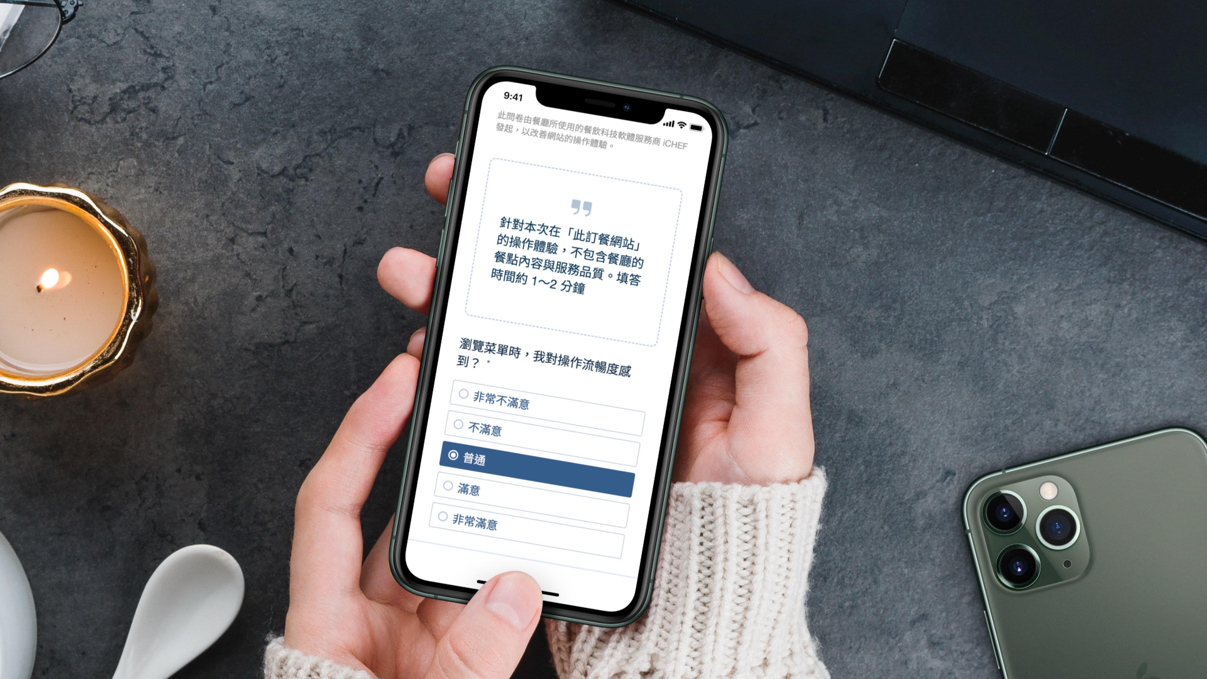
We hope to use a high-quality and reasonably priced survey tool that offers different question types and is easy to export, which is why we chose Survey Cake to create the questionnaire. In terms of questionnaire design, we have also established three principles:
Clear focus
Let consumers know: the survey evaluates the iCHEF ordering experience, not the "restaurant dining experience."
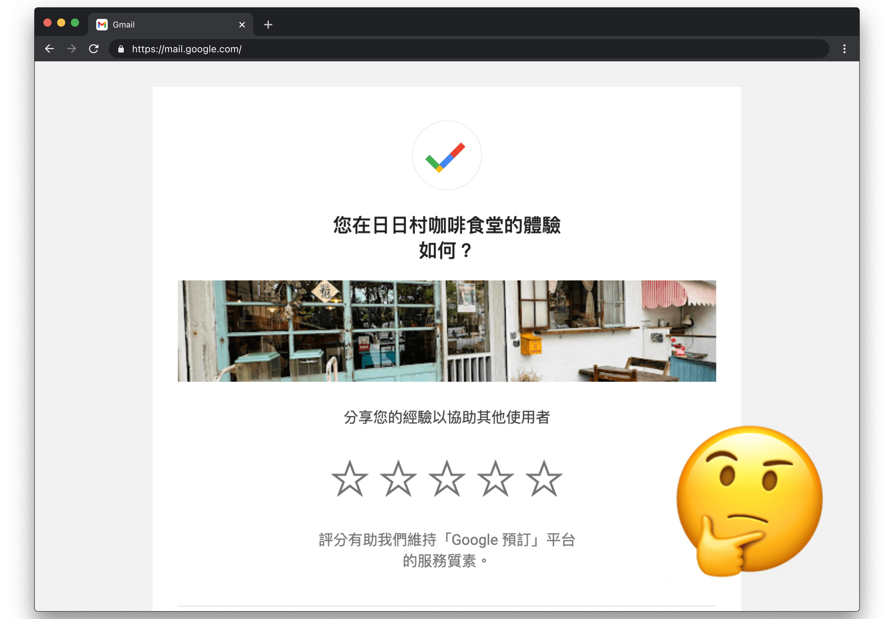
To avoid consumers being influenced by the restaurant's menu or service affecting the validity of their responses, we need to clearly state the purpose and focus of the survey. For example, in the case of a "Google Reservations" satisfaction survey, the wording does not indicate whether responses should focus on the dining experience at the restaurant or the reservation experience.
Facilitates analysis
Collect quantitative and qualitative feedback, and record store information.
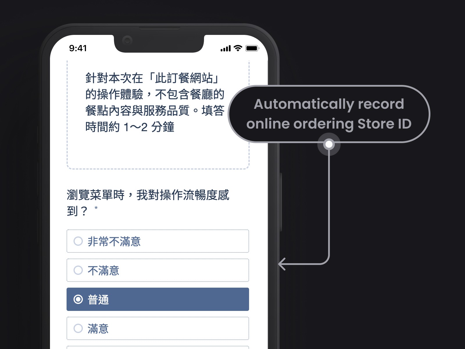
The question types mainly focus on mandatory "options" along with optional "text input." Additionally, we will ask the frontend engineer to automatically include the Store ID of each online ordeing in the questionnaire so that we can understand whether the consumers' satisfaction is influenced by the restaurant's menu structure.
Helpful for answering
Consumers are able to complete the survey efficiently.
We will ensure that the questionnaire is of moderate length, collecting the satisfaction of "key behaviors" of users during their journey, to avoid consumers abandoning the survey.
Survey Content
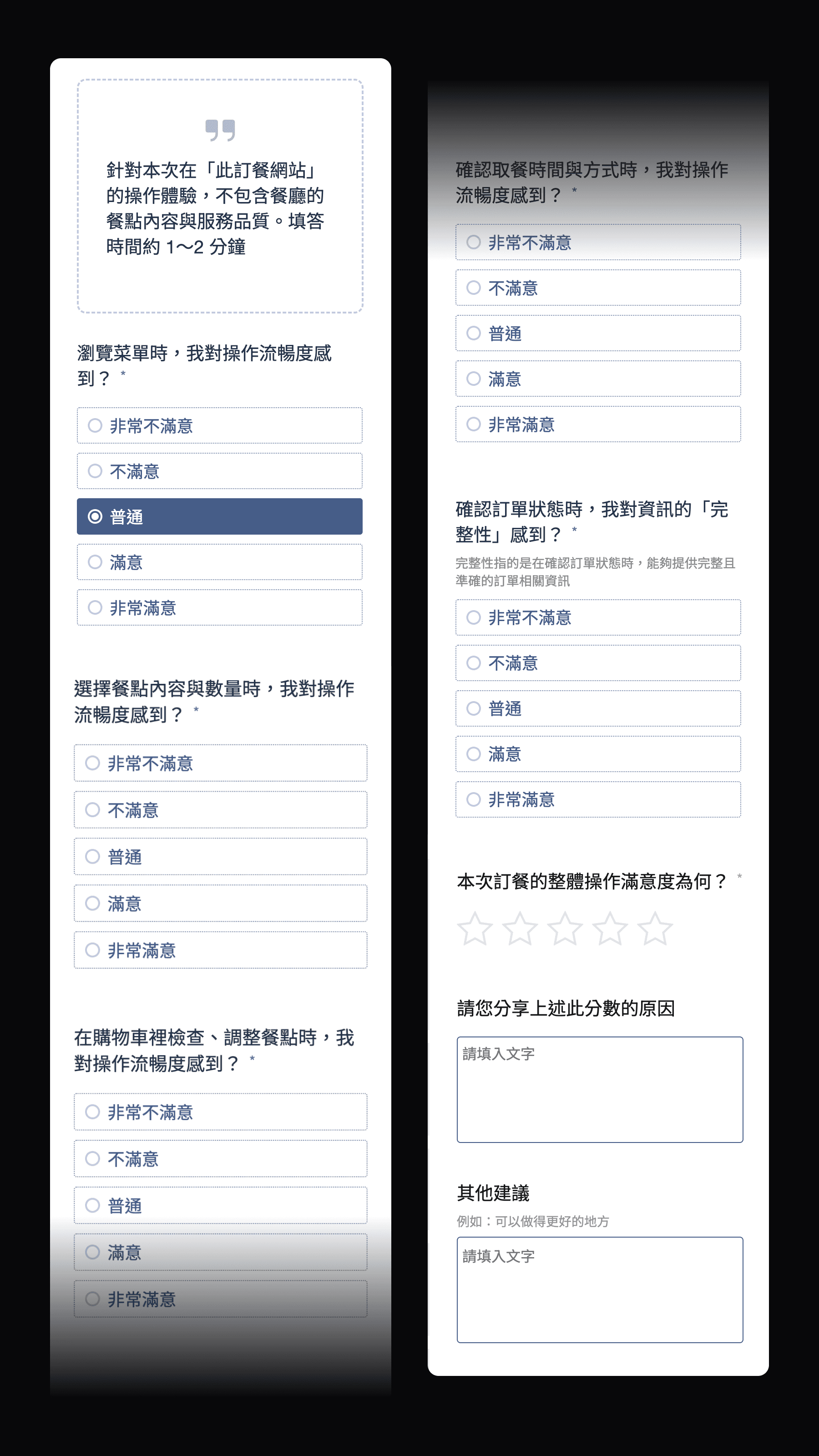
After multiple internal usability tests, we ensured that the final version of the survey allows respondents to understand that it is a survey about the "user experience of food ordering websites". They can also grasp the meaning of each question and complete it in an average of about 30 seconds.
Fill out the survey
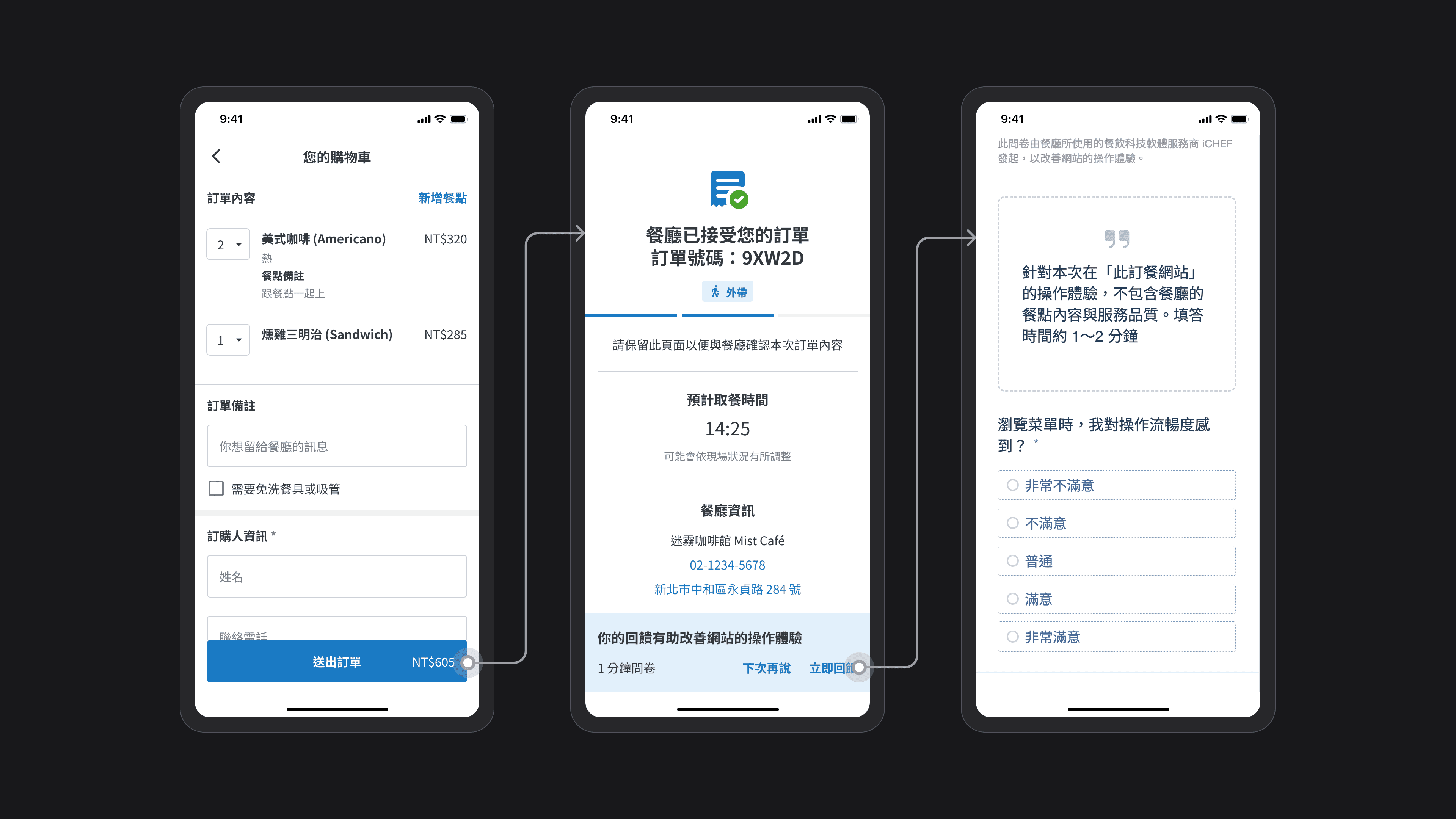
We chose to prompt for a survey on the "Order Status" page after the order is submitted, because at this time the consumer has completed their meal selection and gone through the entire ordering experience, making them more willing to provide feedback and able to give more comprehensive insights.
One month after the survey went live, we collected over 6,000 responses! With a sufficient amount of data, we began to examine the satisfaction distribution and feedback.
responses
Takeout and Delivery
responses
QRcode ordering
User Journey
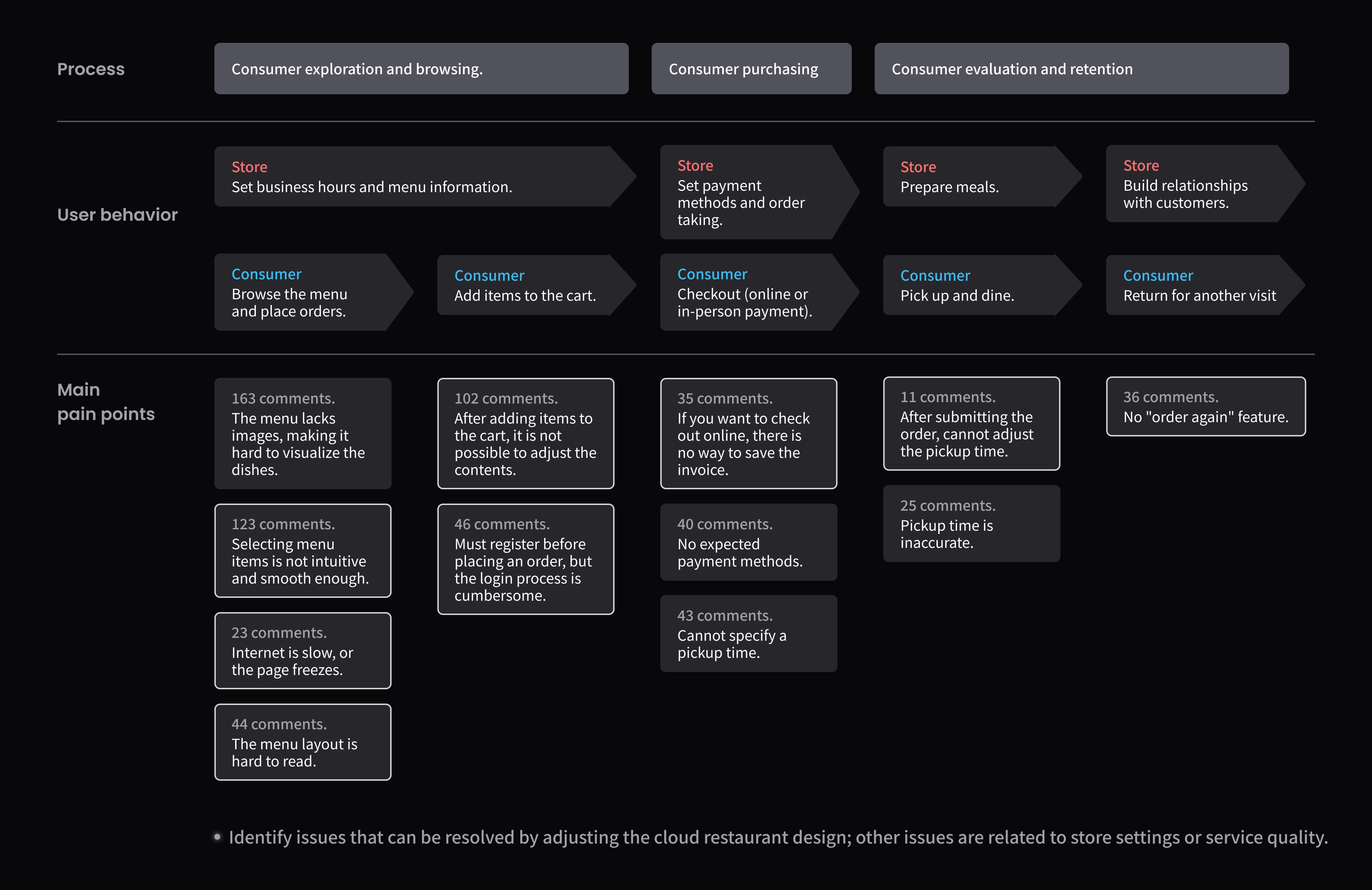
Classify survey feedback by tags
Organize the main pain points into a user journey map
Satisfaction Analysis
After organizing the pain points, we then compare them with quantitative data to list the top three dissatisfaction points. Both categories focus on "adjusting meals and selecting meals," which are also the main pain points for consumers.
Takeout and delivery survey
1
In the shopping cart checkout, adjusting meals: below normal accounts for 22.3%.
2
Choose the meal content and quantity: Below average accounts for 17.4%
3
QRcode ordering survey
1
At checkout in the shopping cart, adjusting the meal: below standard accounts for 18.9%
2
Select the meal options and quantities: Below average accounts for 16%
3
Priority
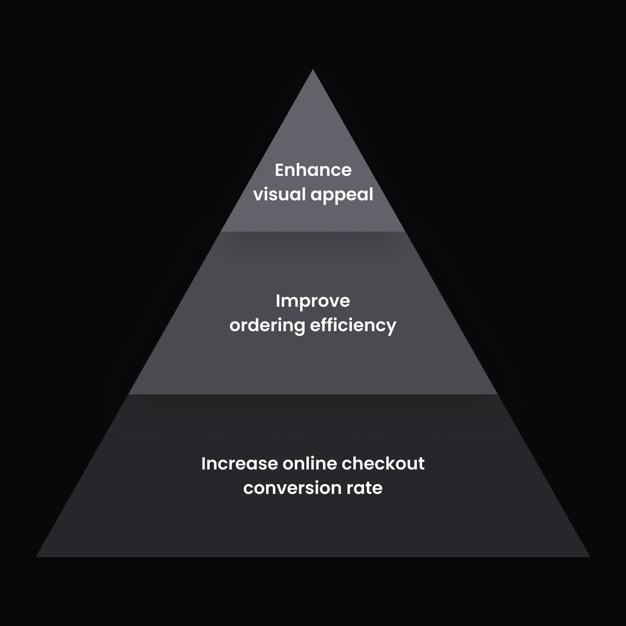
Despite the significant number of observed pain points, time and human resources are limited, so we need to establish a reasonable priority for the requirements. In addition to determining whether it will directly impact the consumer checkout, we will also consider the degree of impact on usability.
Furthermore, although the questionnaire did not mention visual color choices, we also hope to enhance visual appeal (for example, aligning with the different brand tones).
To avoid making the portfolio too lengthy, the following highlights only showcase the projects I was responsible for executing.
Highlight #1
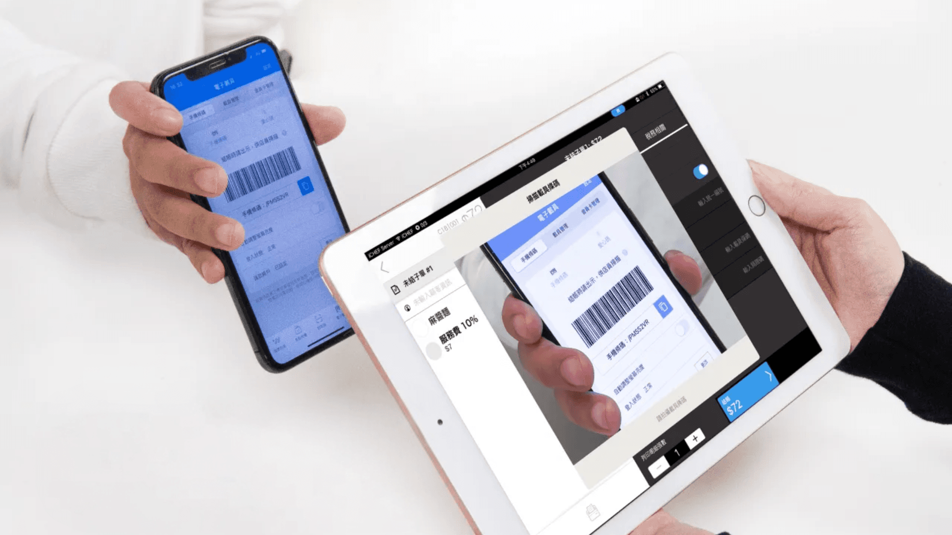
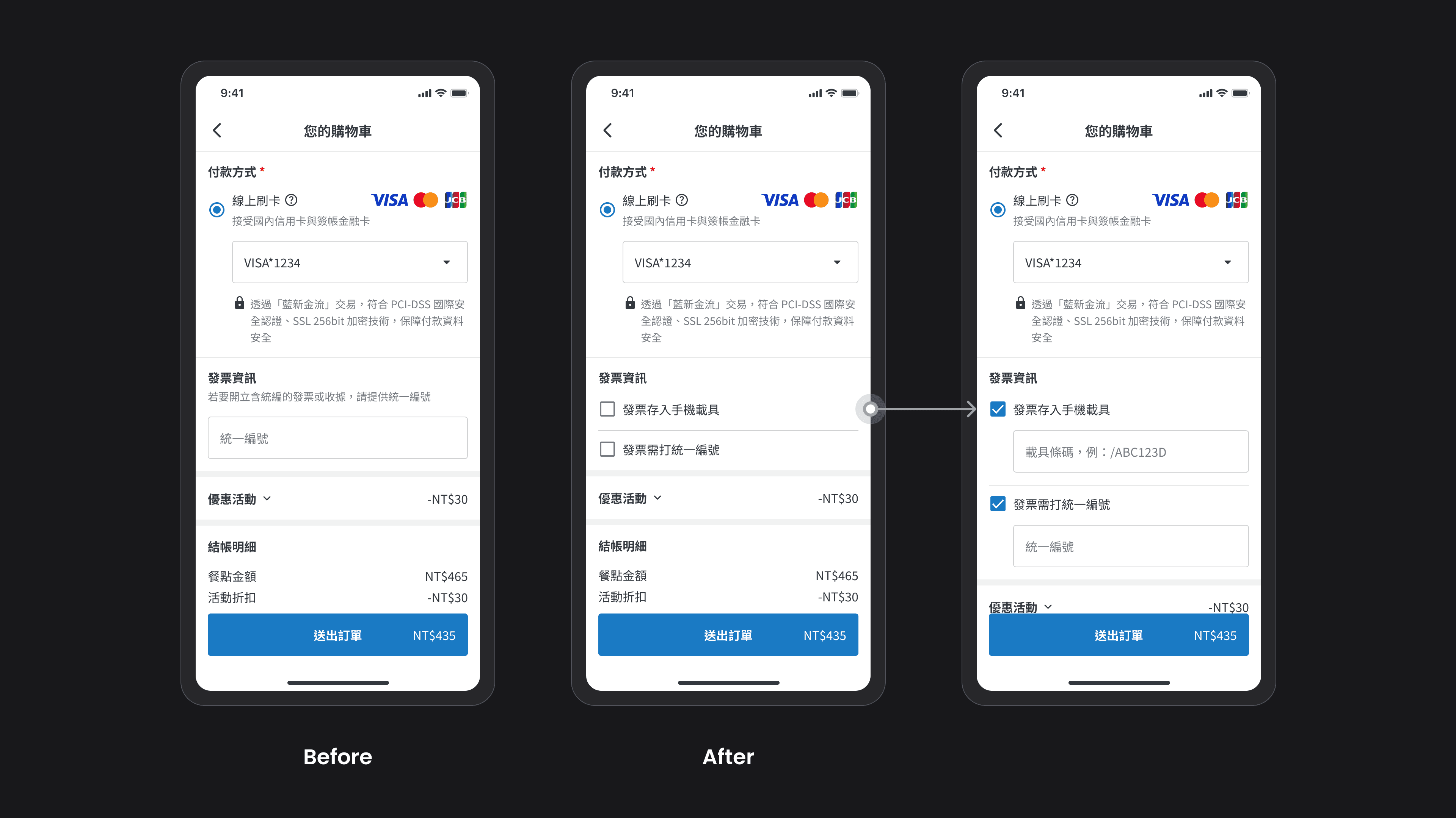
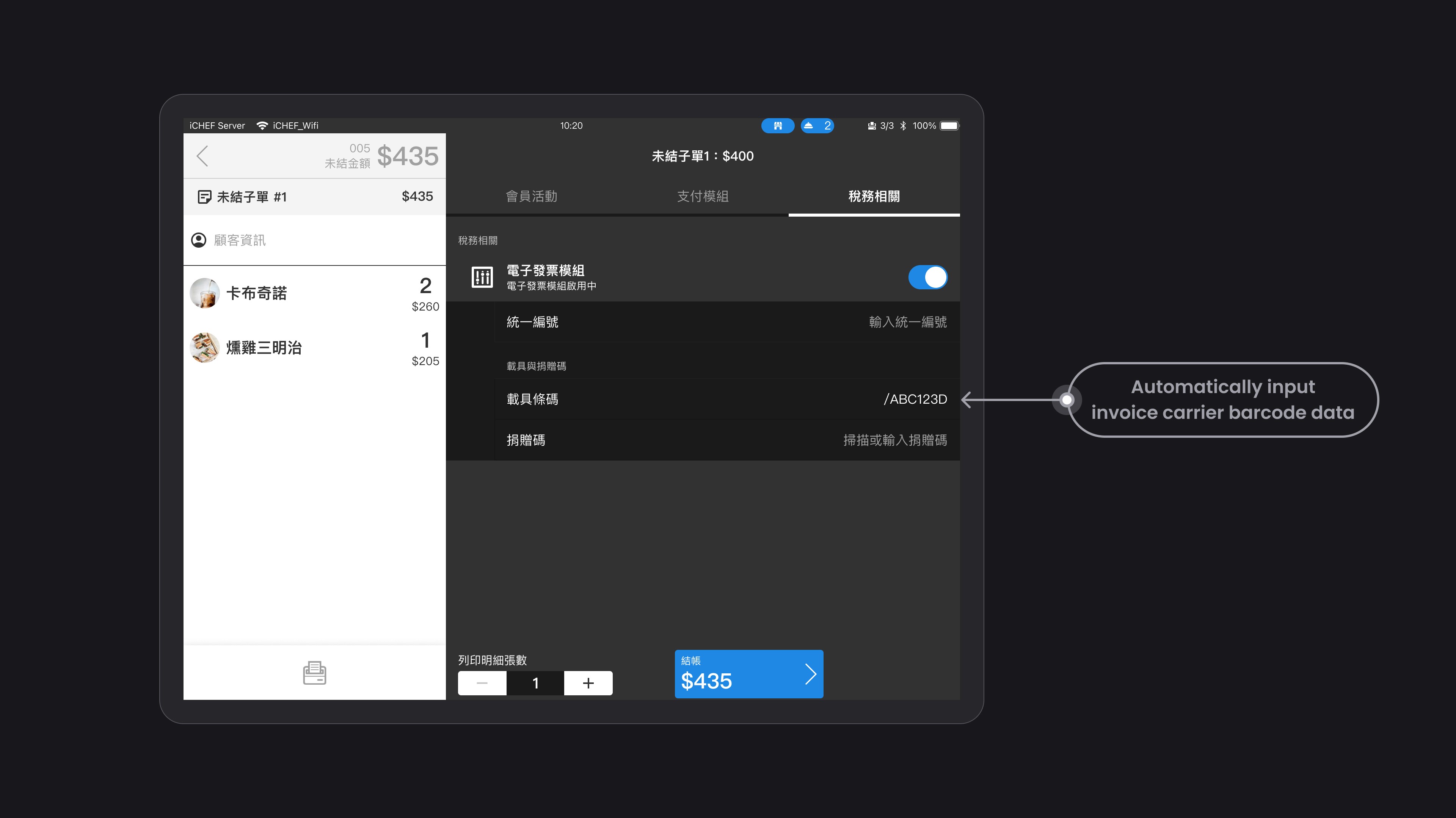
Originally, the online ordering did not have a field for the invoice carrier. If consumers choose to use online checkout, they must request a paper invoice from the store or choose to pay on-site, and then ask the store to scan the invoice carrier barcode using iCHEF POS (as shown in the picture below). To improve the conversion rate of online checkout and the revenue sharing amount, we optimized the payment method field in June 2022.
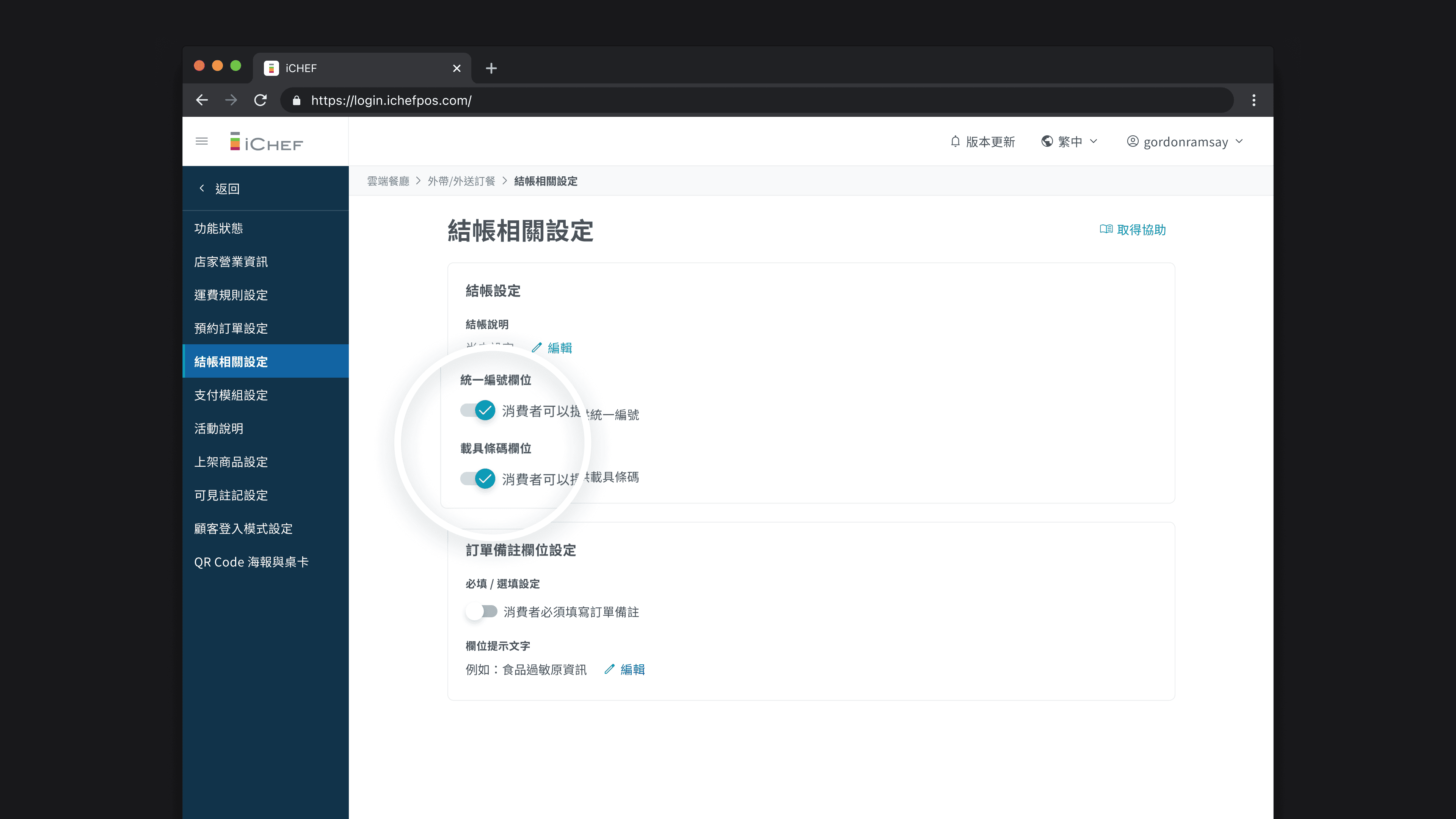
Merchants can enable the invoice carrier field
I added a "invoice carrier" toggle so that stores providing invoice carrier can choose whether to allow consumers to enter the invoice carrier barcode on the online ordering website.
Consumers can enter the invoice carrier
In the "Invoice Information" section on the shopping cart page, the input field has changed from only having the "Unified Business Number" to allowing consumers to choose whether to store the invoice in a carrier or not.
The store automatically includes the
invoice carrier information
If a store accepts an order from a consumer that includes a payment device, when the store checks out, the device barcode field will already be pre-filled with the device information, eliminating the need for manual entry or scanning, thus speeding up the checkout process.
Successfully improved online checkout conversion rate.
Two months after the feature went live in October 2022, we observed that consumers who entered payment information had a higher percentage of online checkout than those who did not, successfully reducing the friction of online checkout.
+
%
Takeout and delivery online checkout rate
+
%
QRcode ordering online checkout rate
Highlight #2
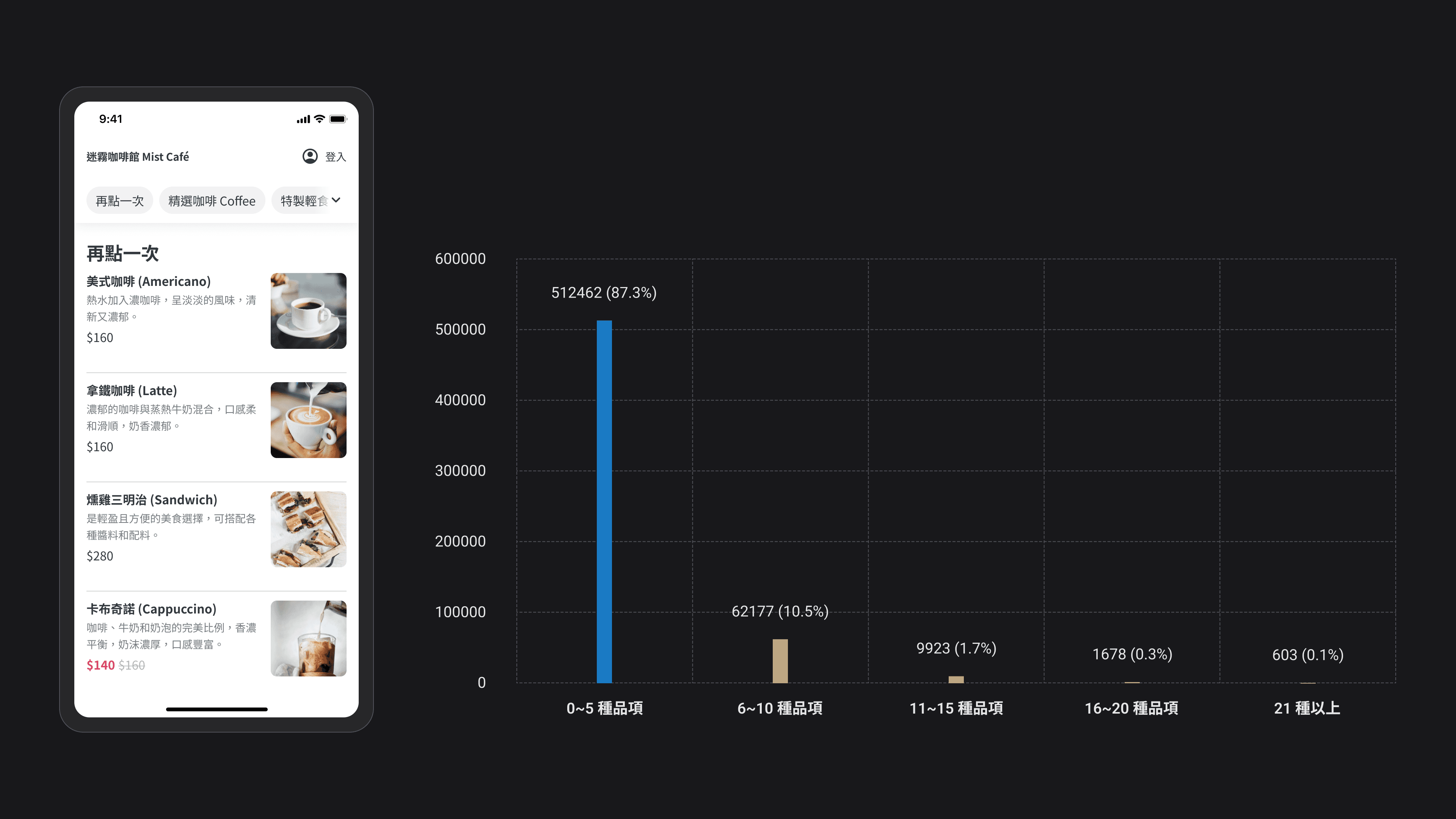
Some consumers, when ordering takeout or delivery from specific online ordeing, want to quickly select items they have ordered in the past. Therefore, I have designed a 'Reorder' section on the homepage, which defaults to displaying 5 items from the last order (data shows that 87.3% of consumers typically select 0-5 items at a time). If the last order has more than 5 items, the remaining items will be collapsed.
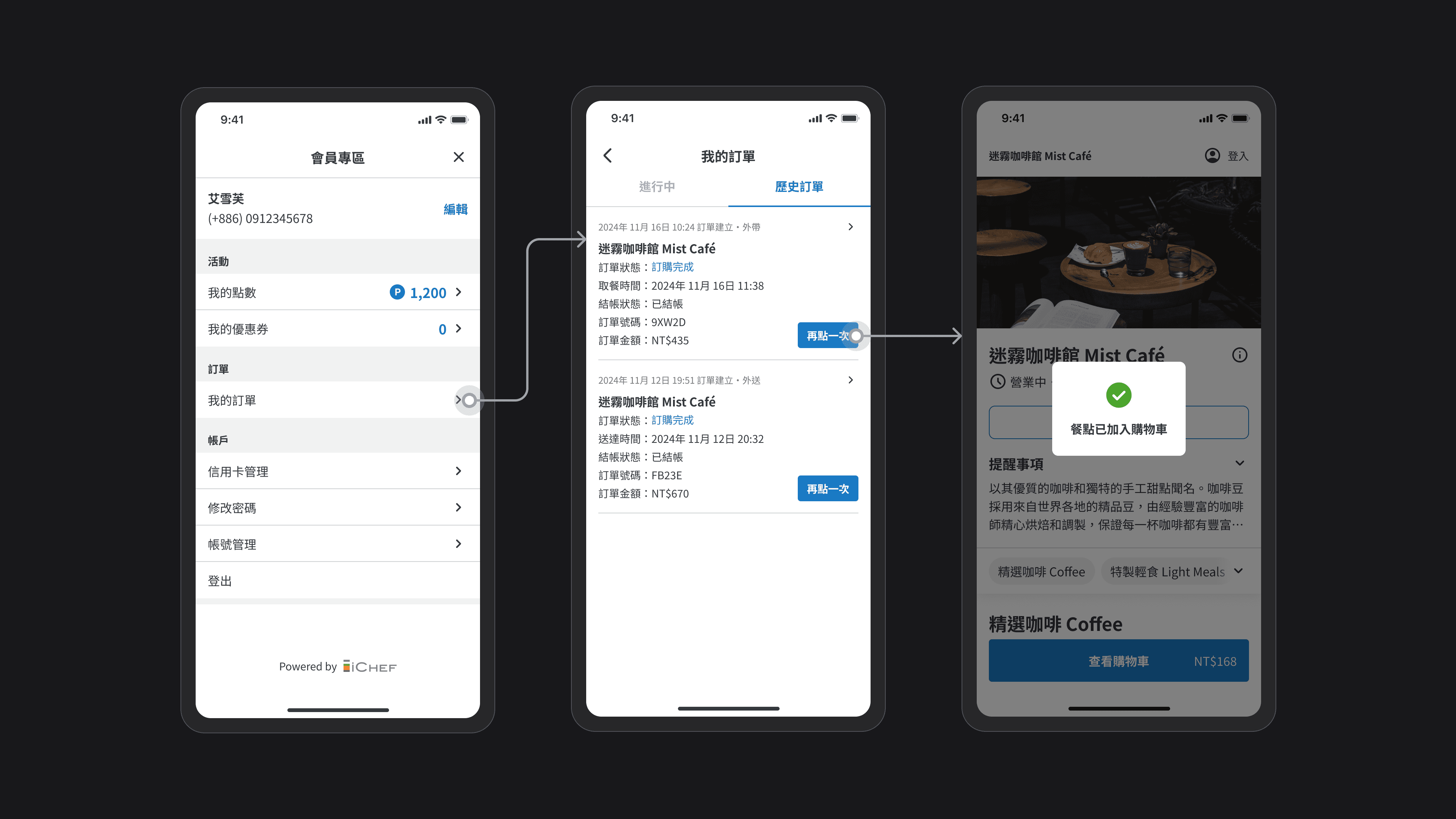
If a consumer is logged in as a member, they can also view their order history in the "Member Area > My Orders" section. By clicking "Order Again," they can add the items and order notes from that order directly into the shopping cart with one click.
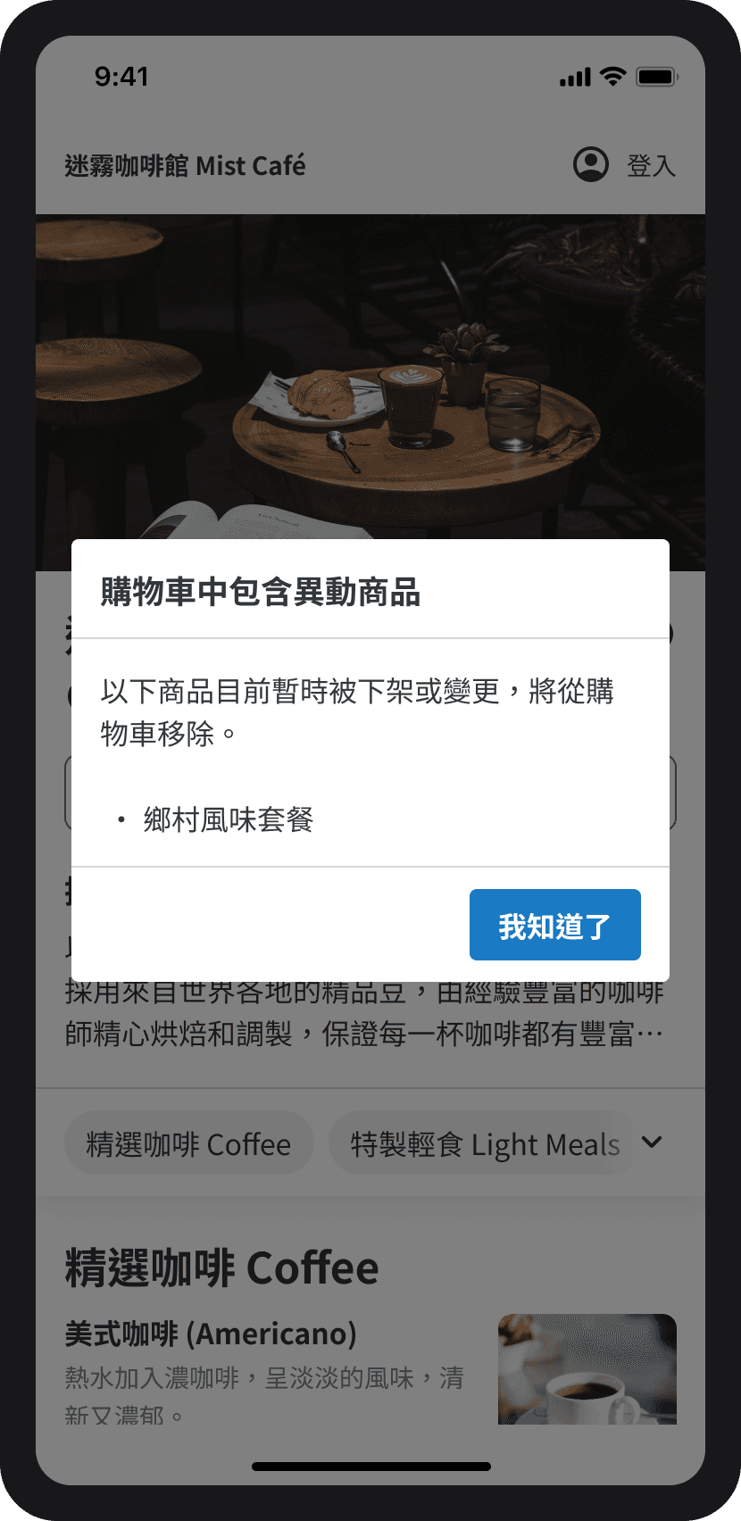
Some items from historical orders may no longer match the current menu of the store. To avoid impacting the store's order, we will automatically remove items that have changed. In the following situations, we will consider the items as changed items:
1
Delete or suspend, for example: a store removes the "Country Flavor Set" from the backend or temporarily suspends it.
2
Change the name, for example: the store renamed "Country Style Set Meal" to "Aussie Queen Brunch."
3
Highlight #3
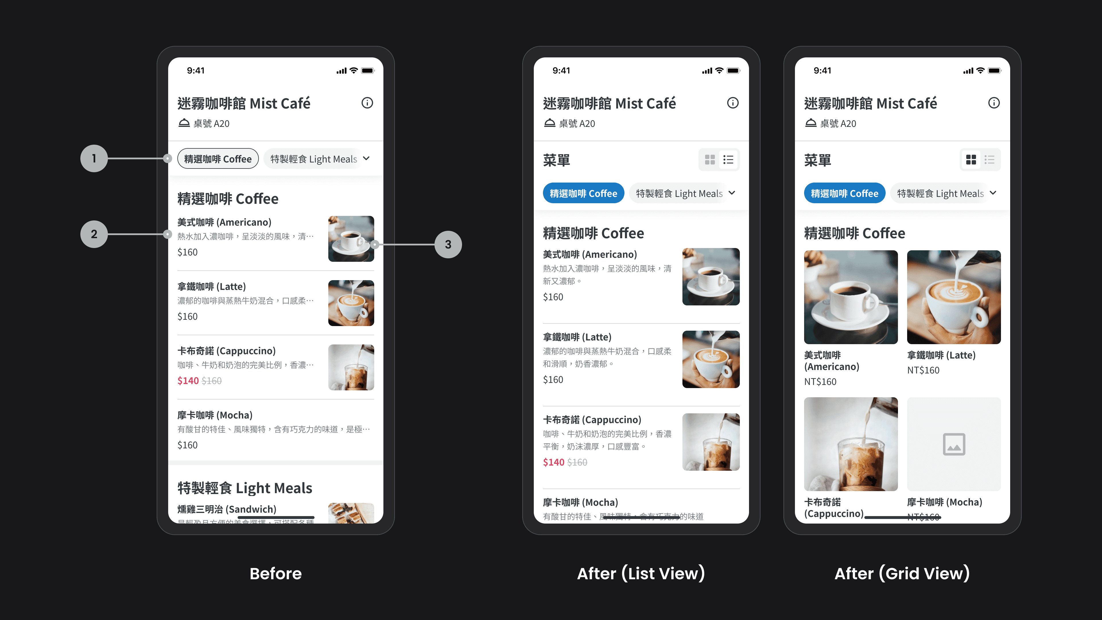
One of the most frequently mentioned issues in the survey results is that online ordeing lack product images, or the images are too small and do not clearly show the details of the dishes. Since we need additional resources and time to explore ways to motivate store owners to take and upload pictures, we will first optimize for online ordeing that have uploaded some product images. In addition to the new grid layout, I also made adjustments to:
1
Enhance the contrast of the selected style for "Product Categories": The original style makes it difficult for consumers to see the current category area.
2
The product description is changed from a maximum of one line to two lines: if the seller has not uploaded an image, consumers can understand the product details through a more complete description.
3
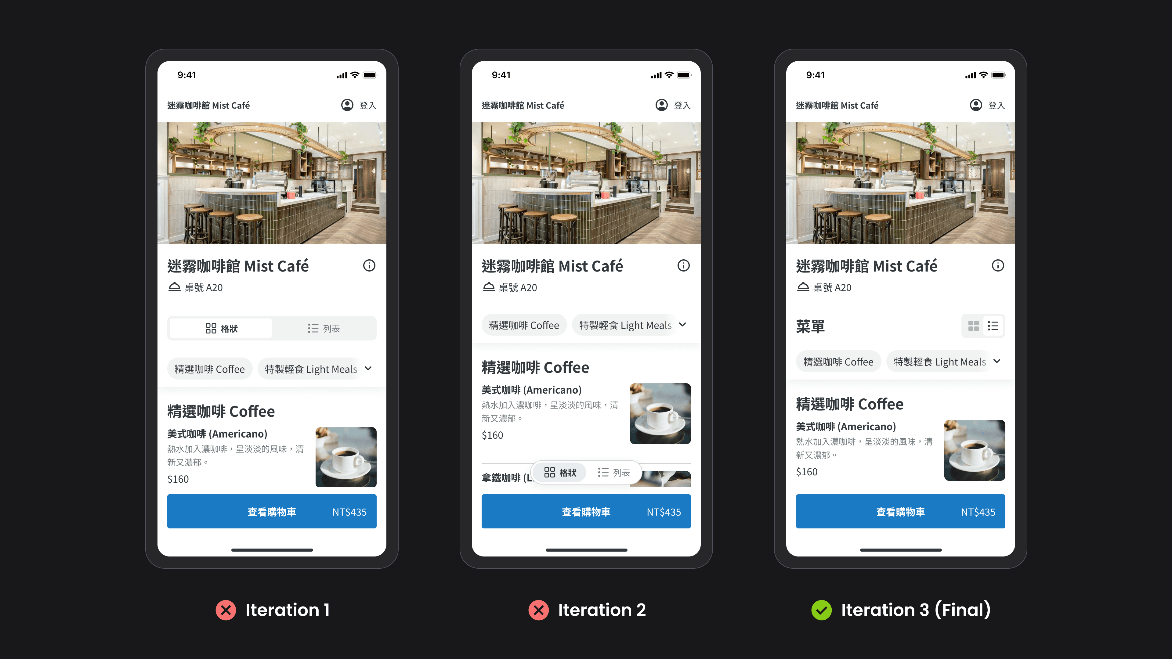
During the iterative process of the "list/grid" toggle component, I tried a segmented control that filled the width of the page and a button version fixed to the bottom of the page. However, both raised the hierarchical level of this action too high (switching view modes is not the primary goal for consumers). Therefore, I ultimately chose to add the word "Menu" to achieve visual balance with the smaller toggle component on the right.
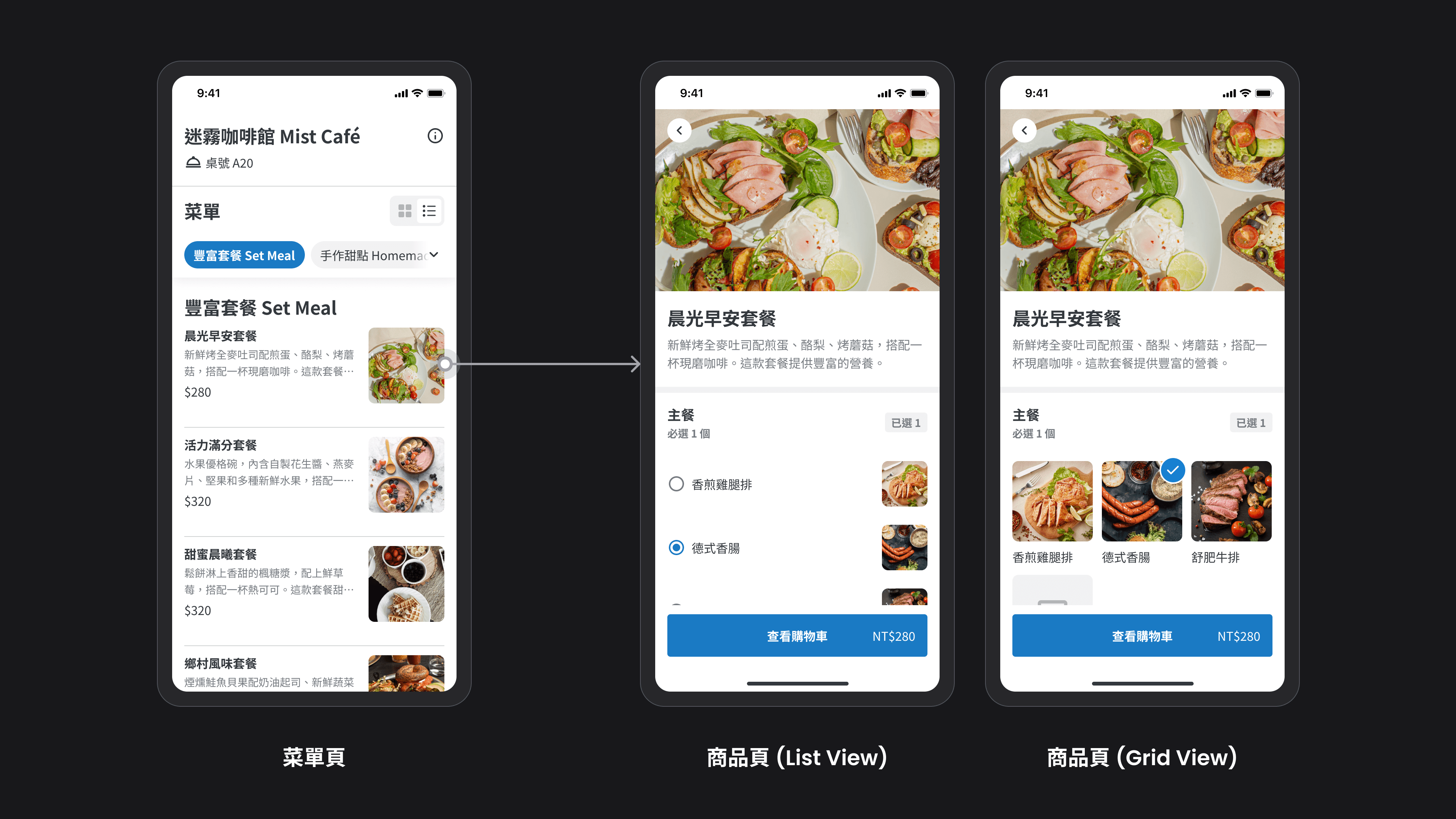
After consumers click on a product, the product detail page will also display the corresponding layout based on the "list/grid" mode of the homepage. Since the main purpose for consumers on the homepage is exploration and evaluation, the grid mode uses two columns. However, once they enter the product detail page, they need to quickly select relevant meal options, so the grid mode uses three columns to avoid excessively long pages.
Taking the product list as an example, it is necessary to consider scenarios such as whether there are images, whether there are descriptions, whether there are discounts, whether items have been selected, and whether they are sold out. We need to account for all statuses to determine if the UI has sufficient flexibility.
Highlight #4
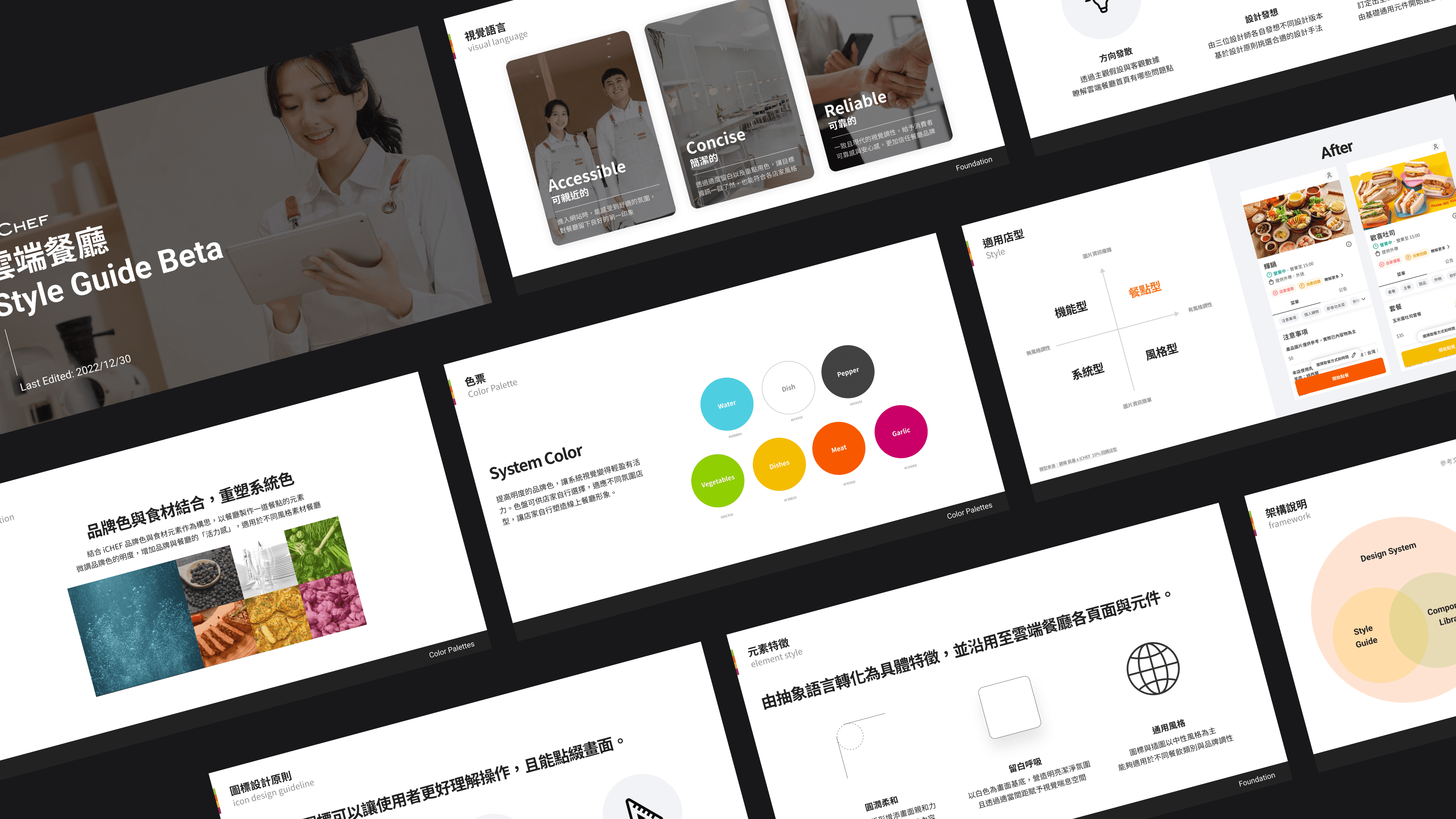
In December 2022, we completed major optimizations that impacted checkout and usability. As a result, I collaborated with two other designers to visually refresh the online ordeing, which included defining the visual language, design principles and styles, and brand color palette, among other elements, and creating a proposal presentation. Unfortunately, at that time, other projects that were more directly related to business goals needed to be executed, so the visual refresh project was put on hold for a whole year.
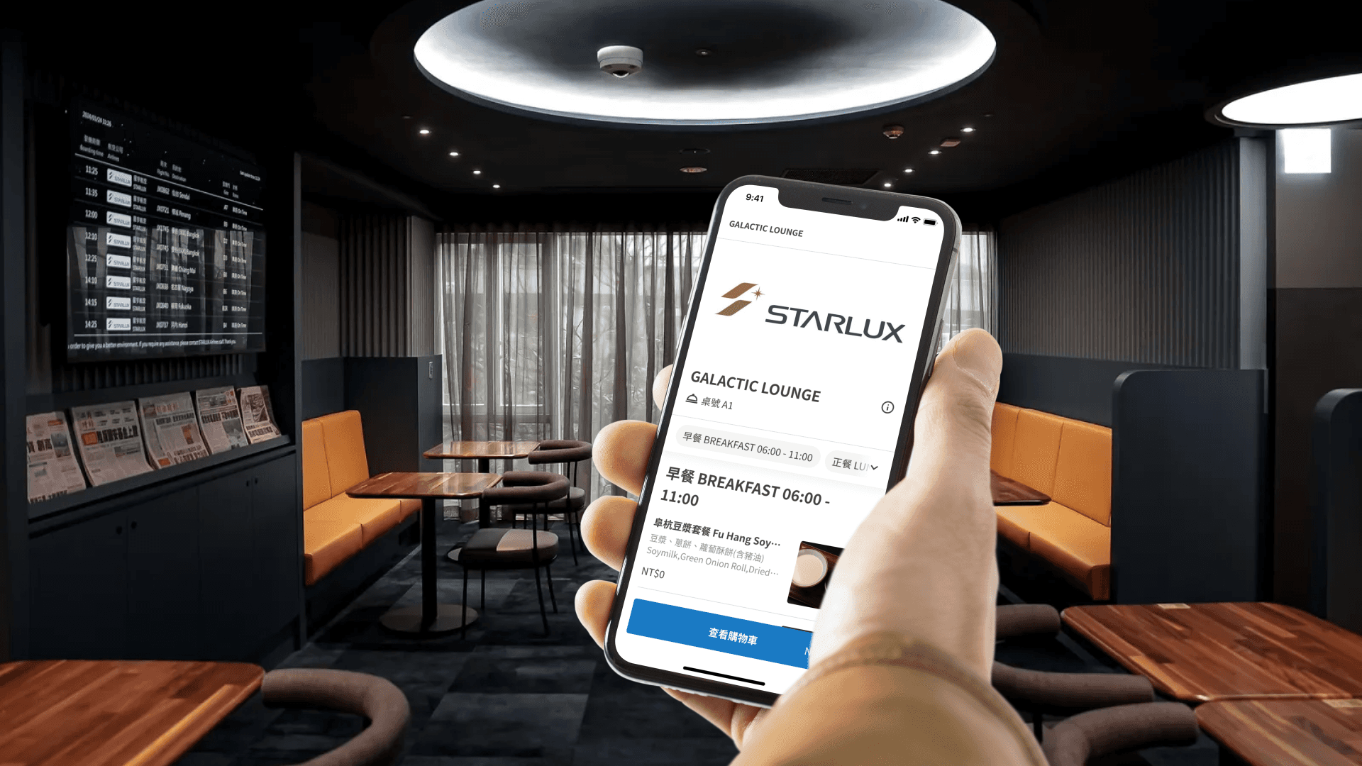
The StarLux Airlines VIP Lounge GALACTIC Lounge aopts iCHEF's QRcode ordering service. The chairman expressed the hope that the website would align with StarLux's brand tone. We restarted the visual renovation project, focusing on adding different themed colors. This not only meets Starlux's needs but will also benefit all merchants in the future.
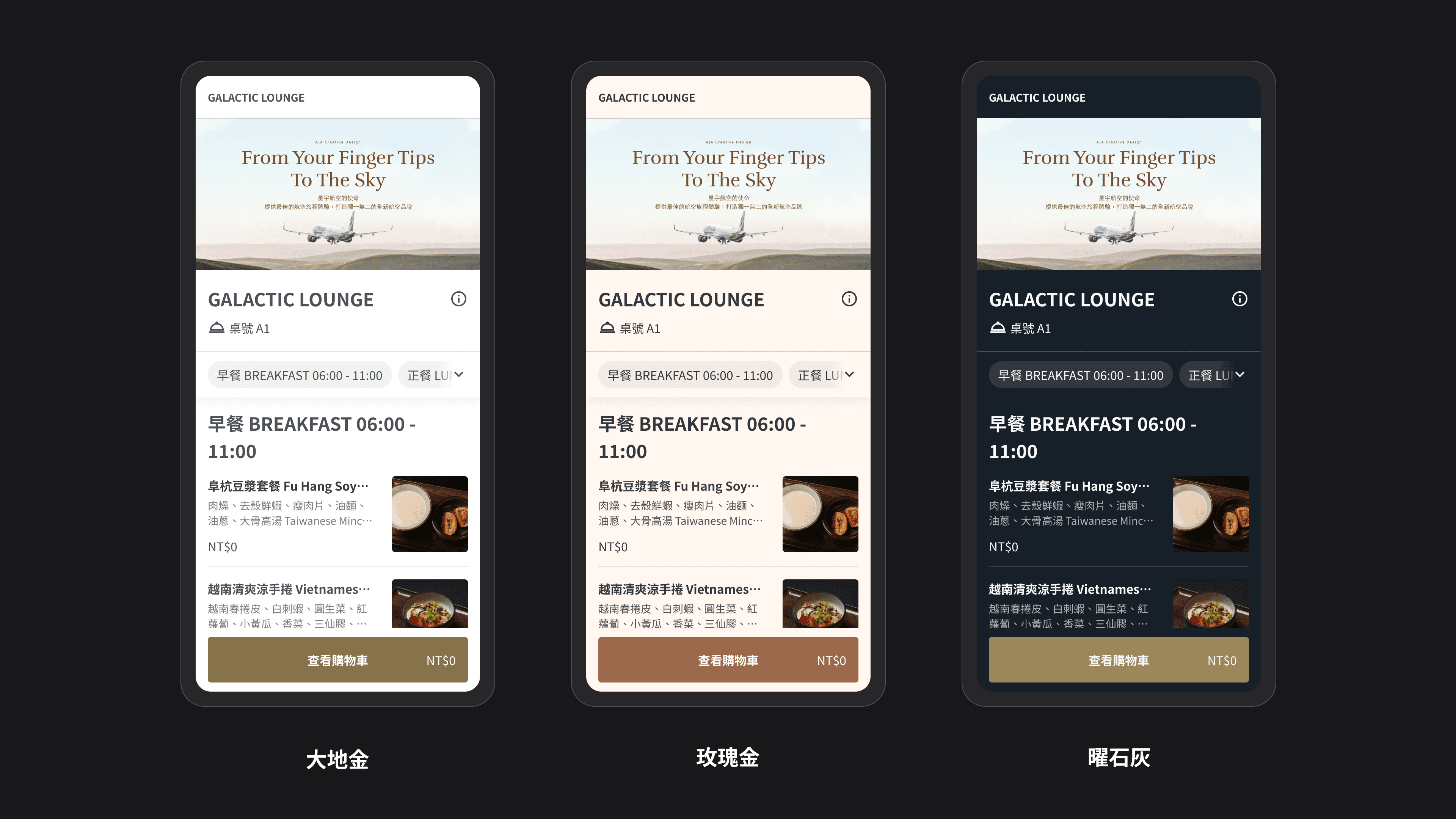
In the proposal presentation, we provided three different color schemes, and Starlux Airlines ultimately chose the dark-toned "Radiant Gray" scheme. Since this color scheme will also be used by other stores in the future, we need to make slight adjustments to the colors to avoid directly using StarLux's brand color palette.
Establishing color design principles for themes
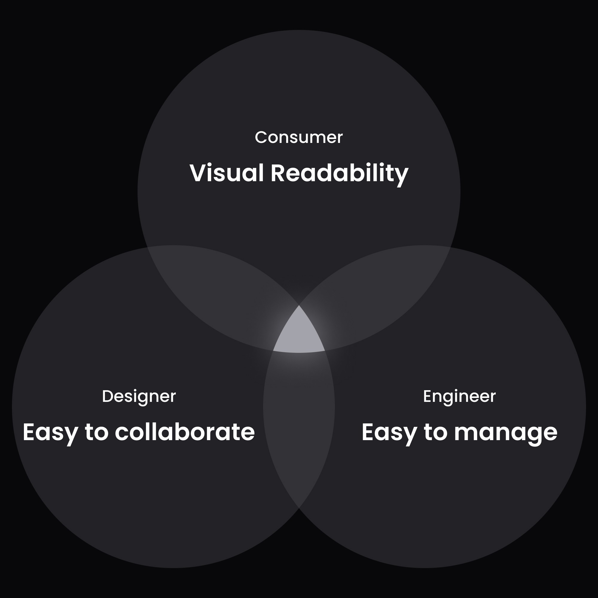
Before further adjusting the color samples, I established three principles.
1
Readability: The color configuration has been tested for contrast, allowing important information to be clearly read.
2
Expansion and collaboration: Providing designers with a clear color logic and definitions to follow.
3
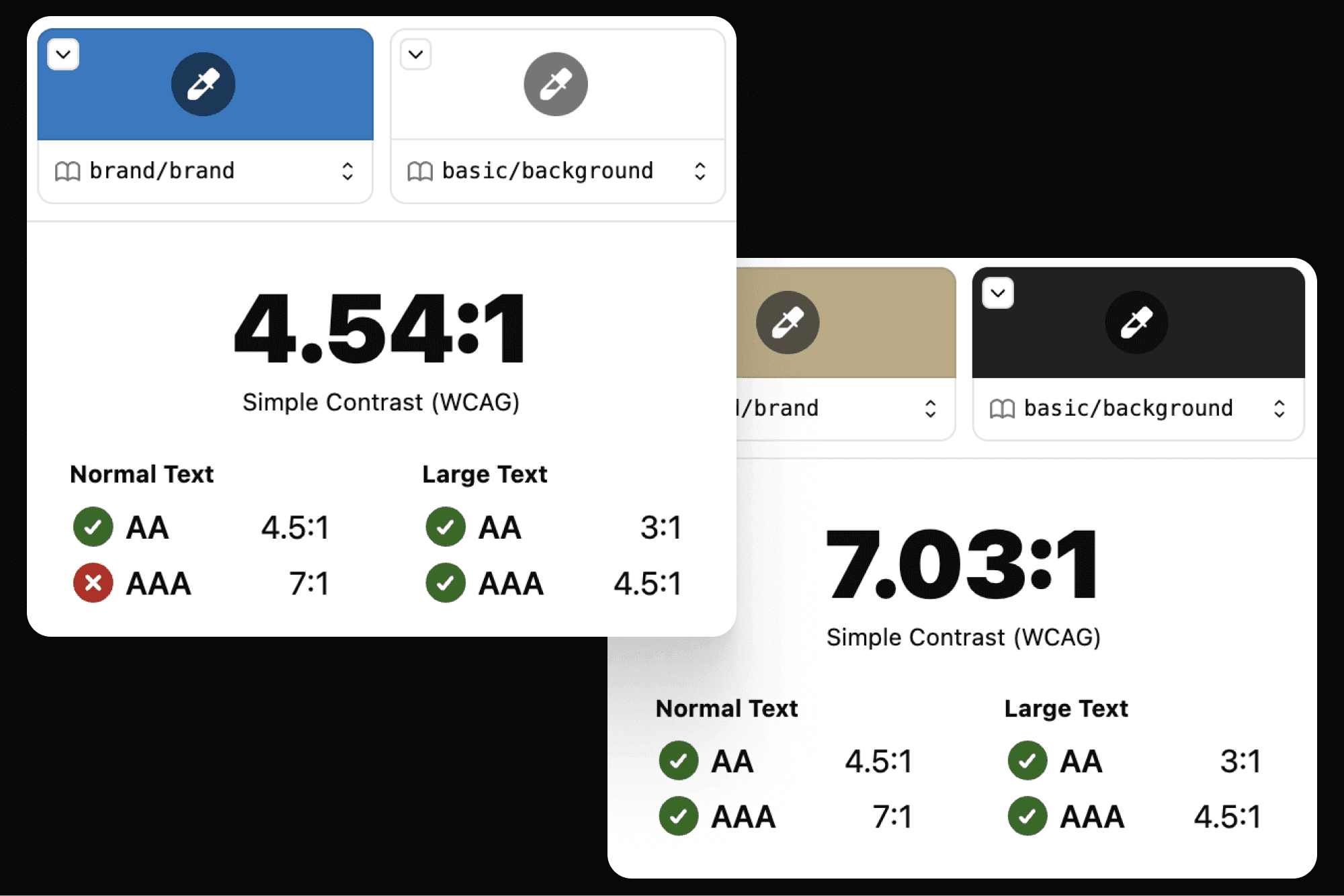
Test contrast using the Figma Plugin
I chose to use the Figma Plugin "Stark" for contrast testing. The standard for light themes is AA (contrast ratio of 4.5:1), while the standard for dark themes is AAA (contrast ratio of 7:1). This is because if the dark theme uses the AA standard, it visually appears somewhat murky and the contrast is still slightly insufficient.
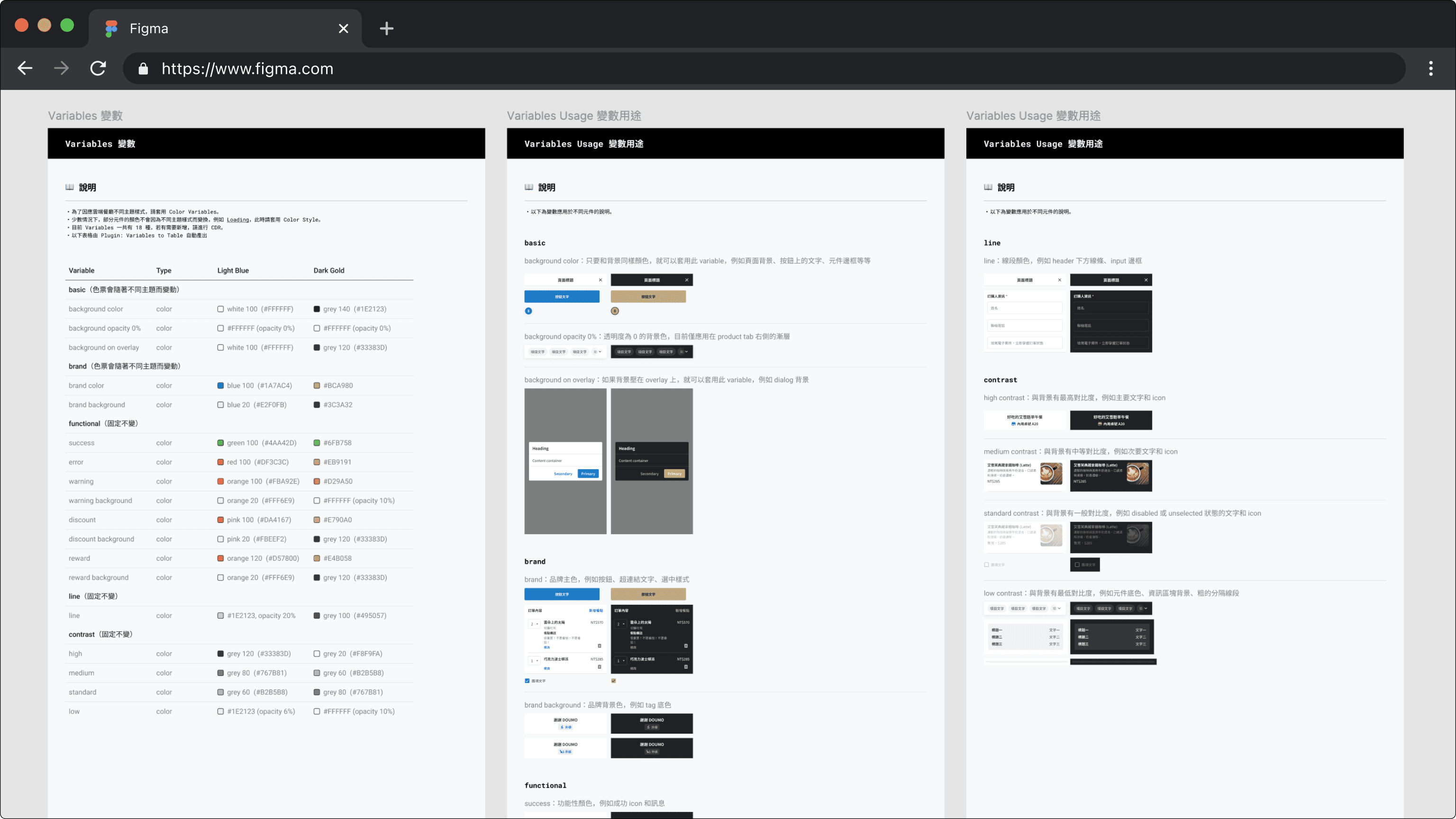
After finalizing the color palette, I added 18 variables to the Design System and applied all components with these variables. This way, designers can easily switch between different theme colors in Figma, and engineers can also view the color swatch. I also wrote about the usage and examples of the variables to help designers understand how to apply them.
Giving a brand new look
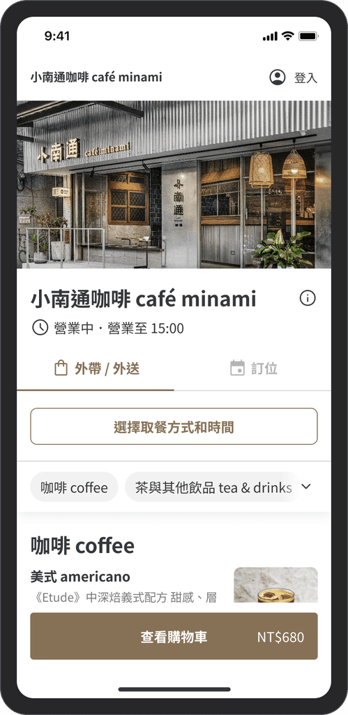
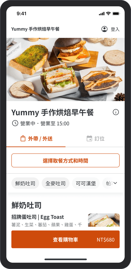
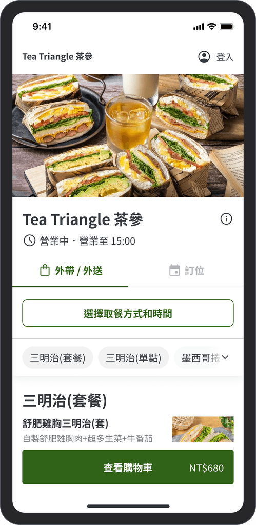
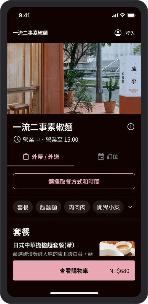
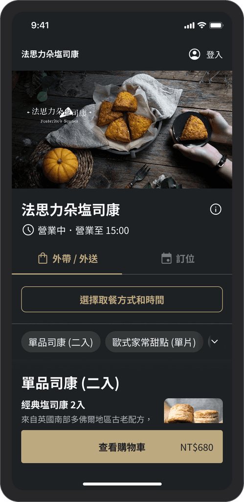
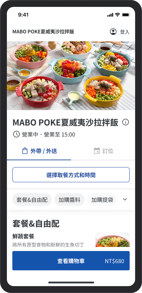
After applying the new theme colors, it has a completely different atmosphere! In addition to the four main pages below, I have organized a total of 206 pages, applying variables to all components.
Currently, we only allow Key Accounts (large brand clients) to apply this theme color. In the future, we will continue to expand different color schemes and allow all stores to select their own theme colors.
Influence
Committed to enhancing collaboration
and quality within the design team
In addition to focusing on the project's goals and execution status, I also care about the team's design process and the quality of other designers' skills. Therefore, after taking on the role of a Mentor, I not only guide the other person's growth but also hope to enhance the overall effectiveness of the design team.
Assist Mentee in growth
From this series of projects, I learned how to plan and divide tasks, and assign appropriate tasks to the corresponding designers, guiding them to grow and achieve their career goals.
Establish a design system committee
Because the project requires frequent adjustments and additions to the design system components, we established the Design System Committee. Members are responsible for reviewing component requests.
Launch Figma lessons
In order to improve the efficiency of the design team, I proactively initiated two Figma internal training sessions after the project concluded (January 2023) and prepared the materials and exercises myself.
Feedback
Thanks for the mutual trust of the project team.
I am very fortunate to meet product managers who have a similar work pace and design values, allowing me to communicate intensively and align directions with them in the early stages of the project exploration.
I am also very grateful to my Team Lead for giving me the opportunity to execute challenging and high-visibility projects, enabling me to showcase more systematic design thinking, all of which relies on a deep foundation of mutual trust!
Thank you, Kat, for discussing the specifications with me in advance, drawing the wireflow, so that the specifications can be visualized during the PM's product requirement document review stage, allowing the planned pace to progress rapidly and confirming the direction early.

Product Manager
Thank you, Kat, for volunteering to take on the project for the online ordeing theme colors. The results are beautiful, and you also effectively promoted the design team to use Figma Variables' new features, which are very convenient.

Design Team Lead
Thank you, Kat, for the beautiful and detailed Figma. The specification inventory is very thorough, and all the scenarios have been listed out, making our discussions much more efficient!
